
BACKGROUND
Jazwares Design System
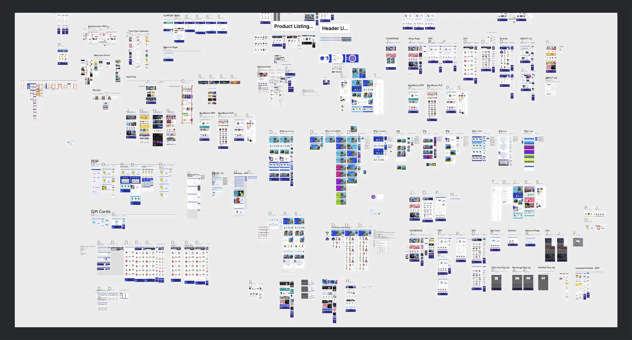
Before I joined Jazwares, the company relied on freelance and agency designers, resulting in scattered efforts and inconsistent UI. After leading the DTC redesign, I proposed and was assigned, along with our corporate UX designer to create the first official Jazwares design system. Built in collaboration with our Creative Services team to bring consistency across products, brands, and teams.
Role
UX/UI Designer
Duration
8 months
Team
Product Manager, 2 UX Designers, Art Director, Front End Developer
System Name
Jazwares Playkit
Inconsistent design and duplicated effort were slowing down product design projects.
My Role
Following the DTC website redesign, I proposed establishing Jazwares’ first centralized design system to address growing inconsistency across digital products. I was assigned to the project alongside the corporate UX designer, working under the direction of the company’s Art Director to define shared foundations, components, and standards. Together, we created a scalable system used across brands and internal teams to drive consistency, efficiency, and a cohesive product experience.
THE ASK
How might we support new designers and teams by building a scalable, shared system for designing cohesive digital experiences?
THE APPROACH
Laying the Foundation
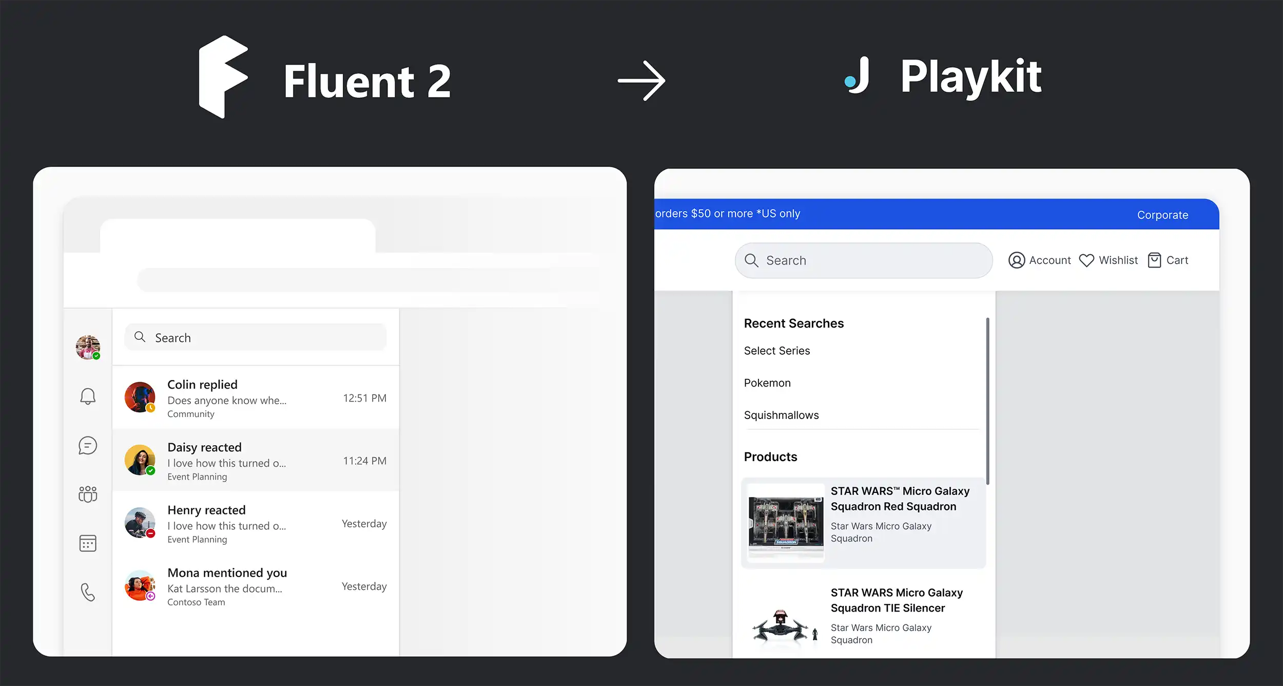
We began by studying Microsoft’s Fluent Design System as a framework, then broke everything down to the atomic level, auditing colors, typography, spacing, and components to reflect the evolving Jazwares brand. Using the atomic design methodology we merged existing patterns with new, intentional decisions to create a solid and scalable foundation for future digital products.
The Atomic Design Methodology
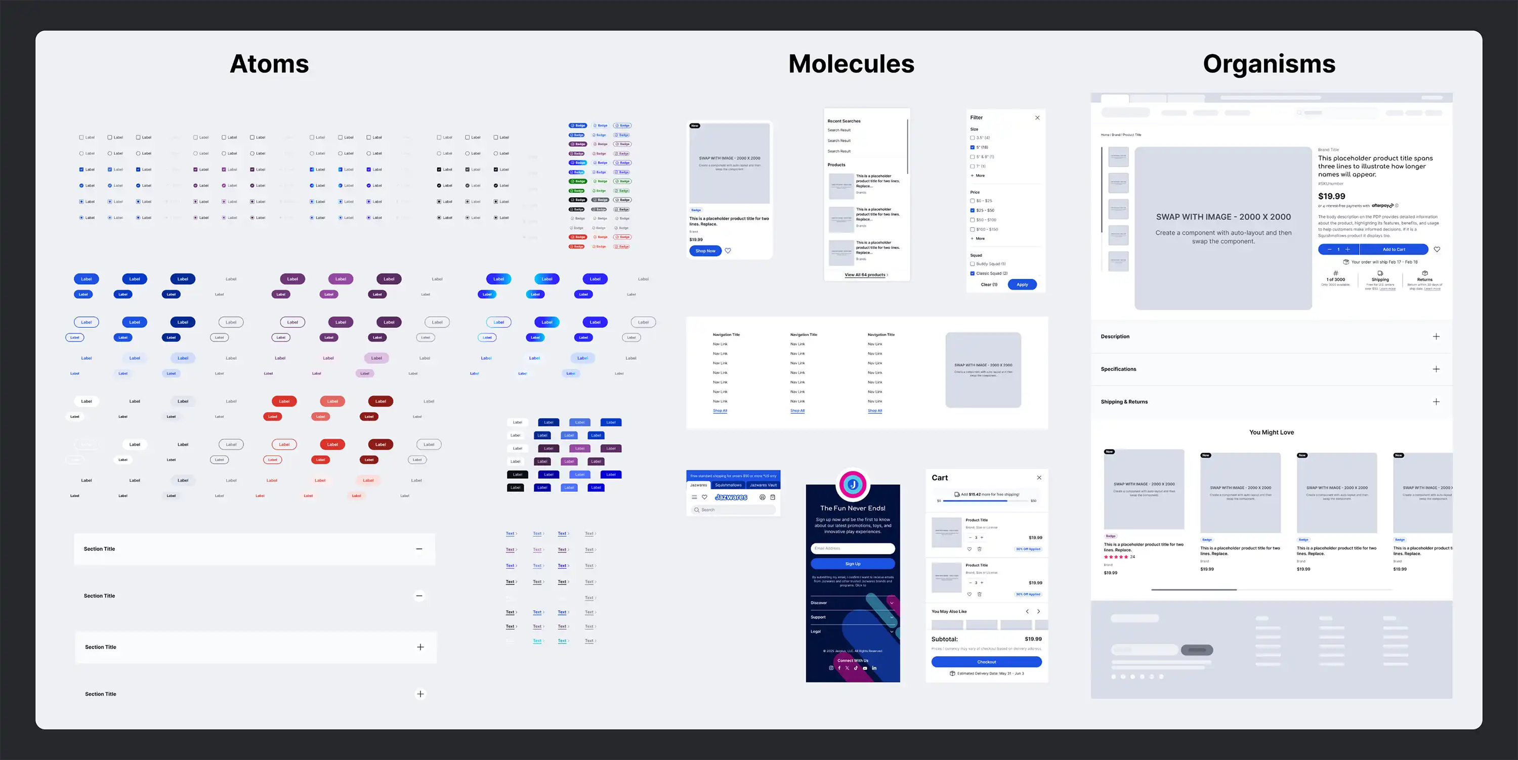
We used the atomic design methodology to organize the system, starting with the smallest building blocks like colors, spacing, and type, then scaling up to reusable components and full-page templates.
In Partnership with Brand
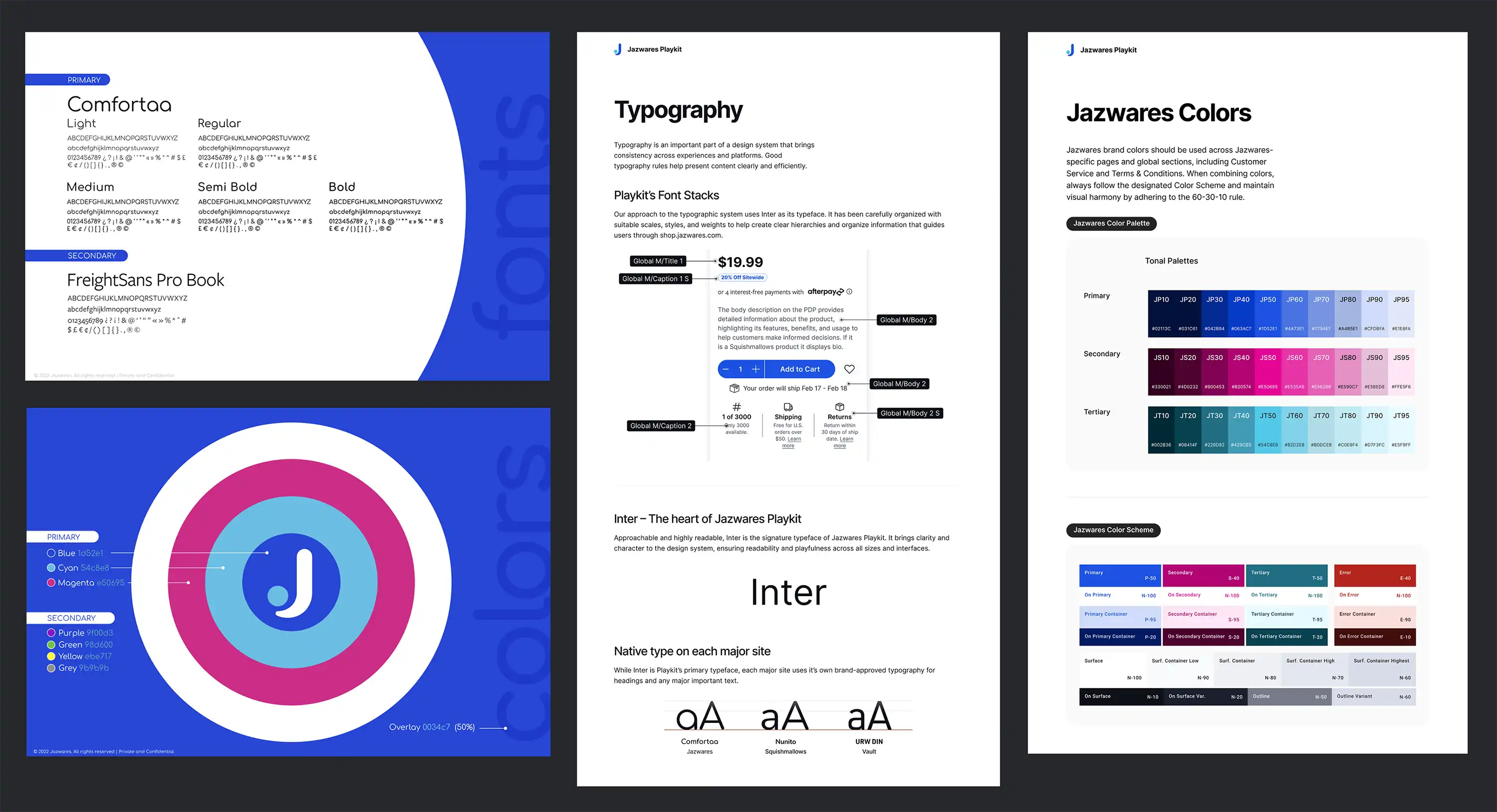
We partnered closely with our brand designers to transform their static style guides into a fully functional design system. By applying accessibility principles, UI best practices, and rules like the 60-30-10 color model, we built a system that not only stayed true to Jazwares' identity but also worked seamlessly across digital platforms.
THE SYSTEM FOUNDATIONS
The Token System
We began by establishing a robust token system to define our design foundations (colors, typography, and spacing) using clearly named references. This approach made it easy to apply consistent styles across components and scale the system efficiently. Every element is driven by a token, creating a single source of truth that designers and developers can build on with confidence.

Reducing the Need to Detach Components
To ensure consistency and flexibility across all digital products, each component in the Jazwares Playkit is built with all possible variants in mind. Every state is accessible via Boolean, text, or slot overrides, which is meant to minimize any detaching. This architecture allows designers to explore features and edge cases without compromising the integrity of the system.

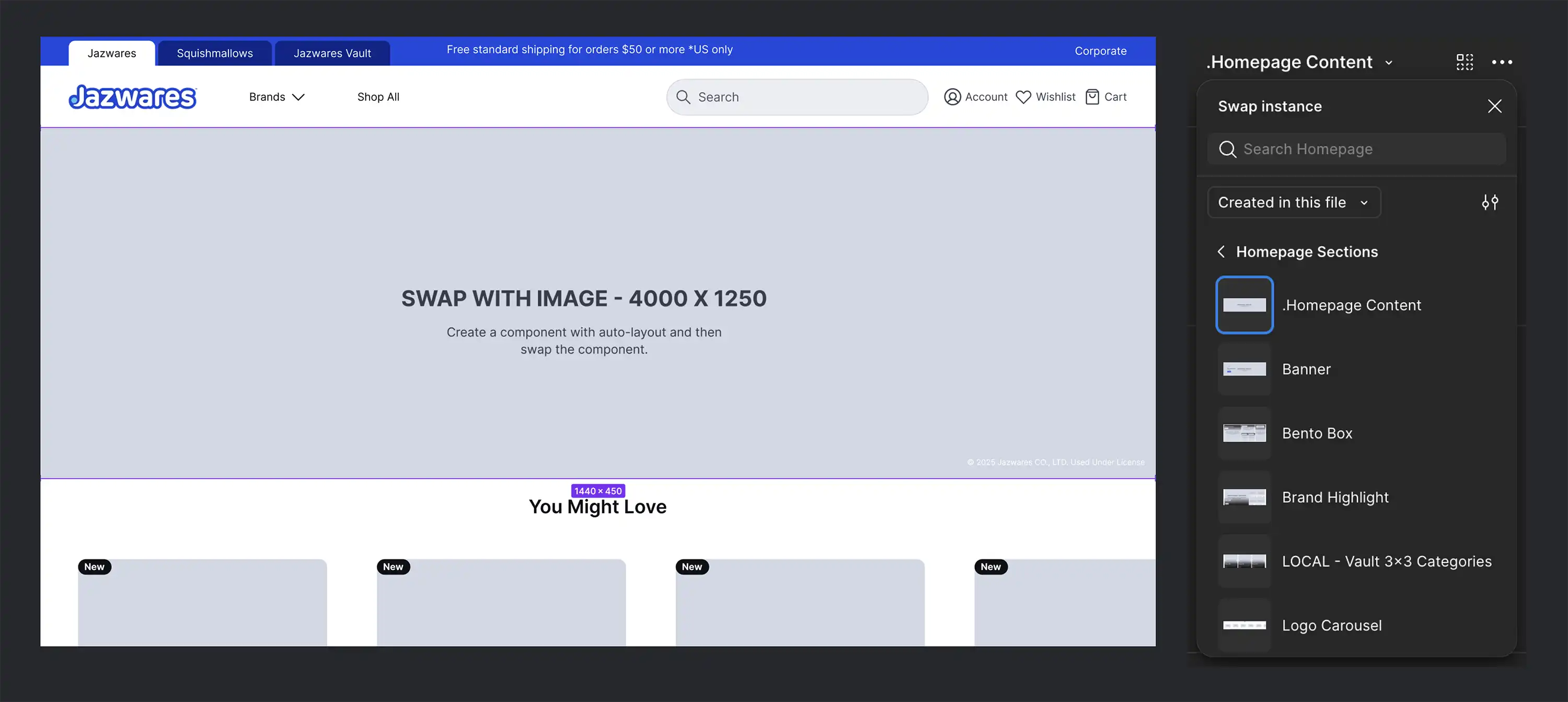
Introducing Slot Components
To avoid detaching components while still allowing flexibility, we introduced slot components. These let designers swap content within structured layouts like headers, footers, or icons, without altering the core spacing or logic of the original component. It kept things scalable, reusable, and consistent across use cases.
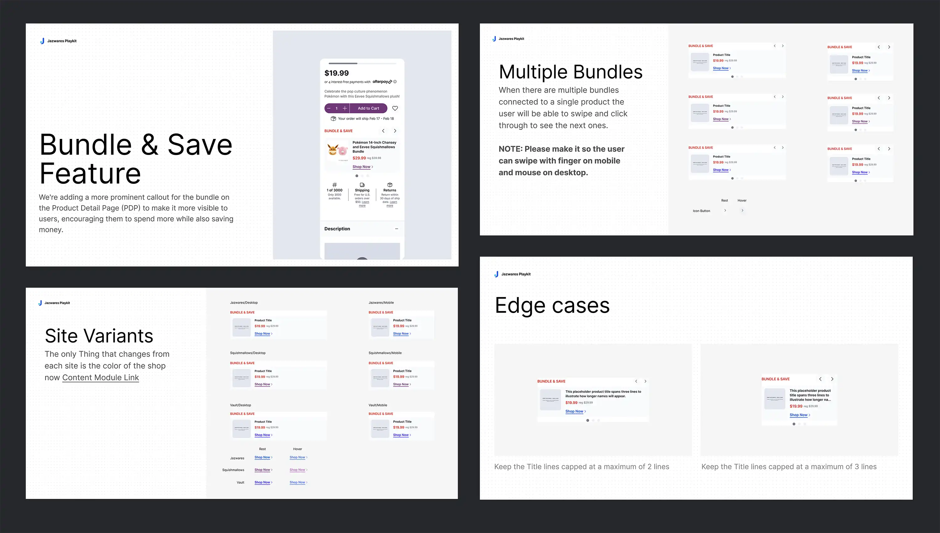
A New Way to Design and Deliver Features
Each new feature or update begins in a dedicated Figma file, complete with explorations, iterations, prototypes, and documented rationale for every decision. This structure ensures clarity for both designers and developers, simplifies feedback, and makes it easier to merge approved components into the broader system with full context.
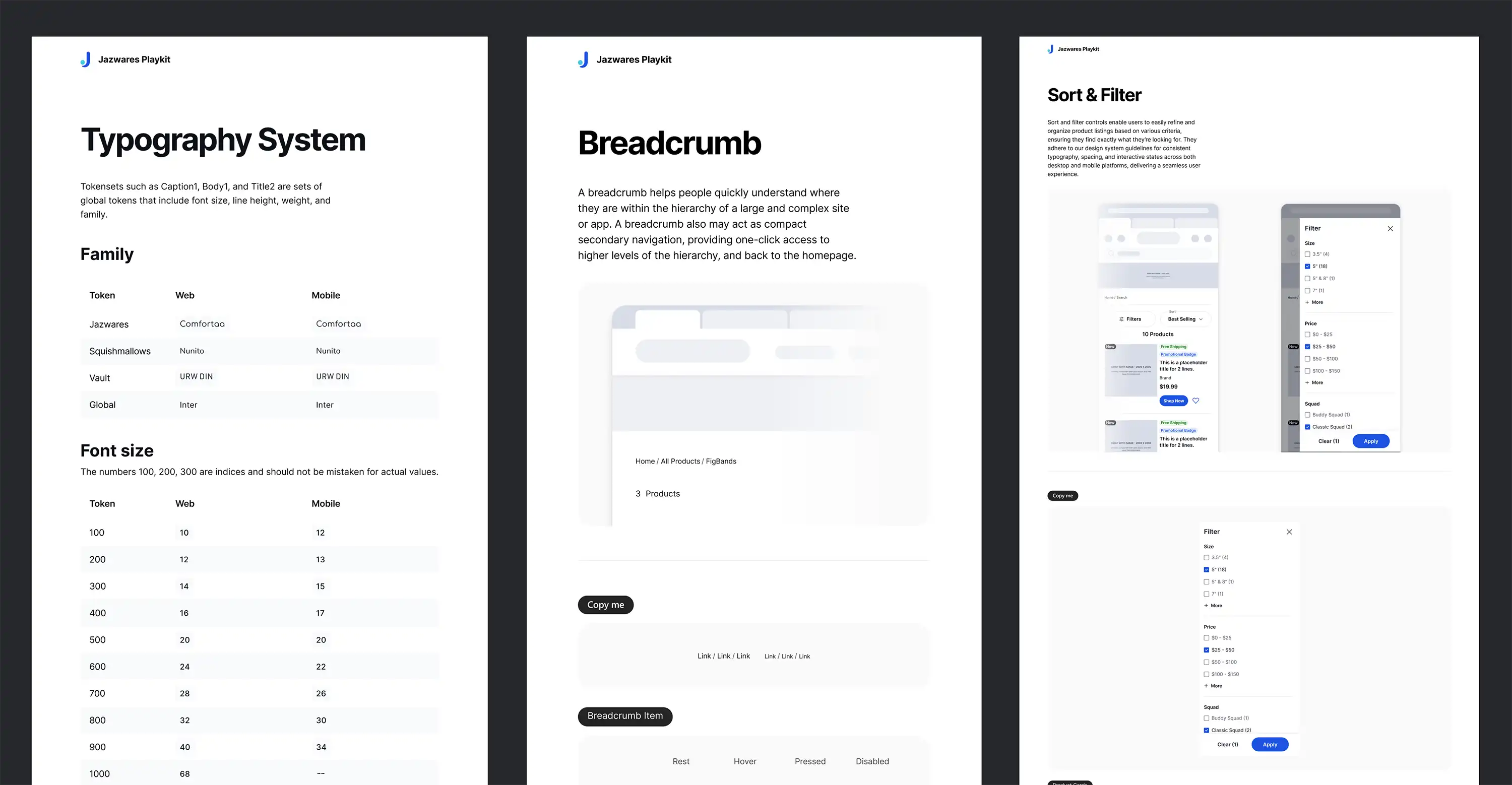
Documentation at Every Level
Documentation was a cornerstone of this system, from atoms to fully composed pages. Every component included usage guidelines, behavior rules, and reasoning, so any designer could understand and confidently apply it. The goal was clarity: fewer questions, smoother handoffs, and scalable design decisions that last.
Designers
Designers could focus on solving user problems rather than rebuilding components, speeding up design timelines and improving team collaboration.
Developers
Handoff was smoother, dev time decreased, and alignment between design and engineering improved significantly.

The Company
By unifying branding and streamlining workflows across teams, the Playkit system accelerated production timelines and improved launches.
Reflection
Working on the Jazwares Playkit taught me so much about what it really means to design at scale. It pushed me to think beyond just how something looks to how it functions across teams, how others interpret it, and how it fits into a growing ecosystem. It made me a lot more intentional with structure, spacing, documentation, and communication overall.
Next Steps
The design system is just the beginning. As we continue to build new features and digital products, we will keep refining Playkit, focusing on stronger documentation, smoother handoffs, and small improvements that make a big difference for designers and developers alike.